Mousetrap

by Robert Santafede

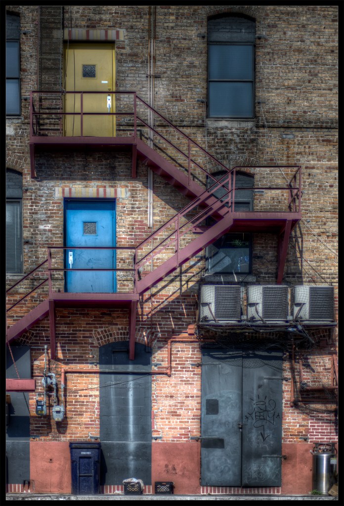
"Moustrap", a photograph by Robert Santafede, color version.

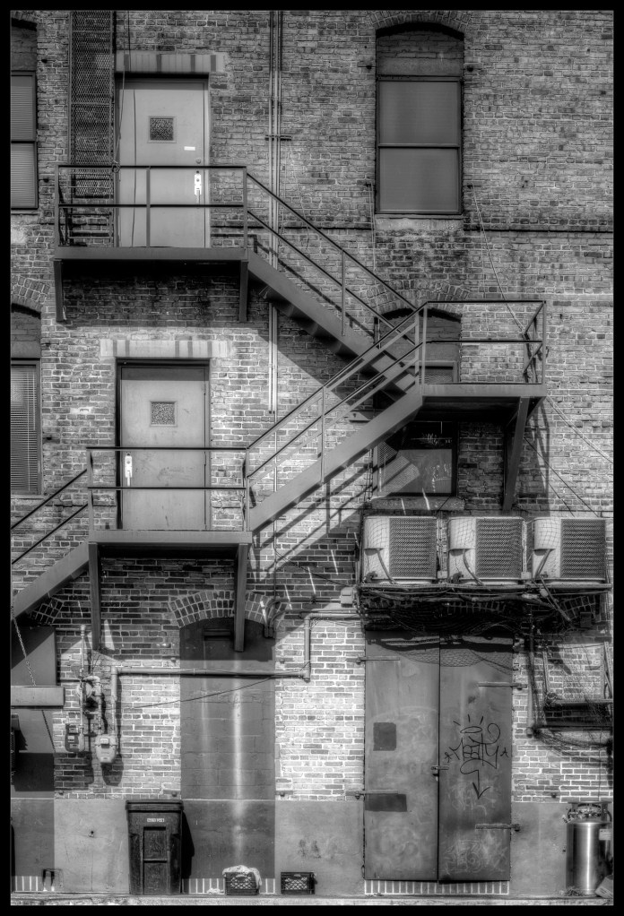
"Mousetrap", the black and white version by Robert Santafede

Had a hard time letting the colors go in this one.. So why not post both?

83 Comments to “Mousetrap”

  1. Richard Guest's avatar

    Particularly like the way the fire escape leads your eye through the colour version. Great image.

  2. russellchapman's avatar

    Both are great but I prefer the B&W 🙂

  3. Geert de Brabander's avatar

    Great Shot robert, this thime i prefer the colors.

  4. Sara Mac's avatar

    I love the color but have to admit I still love the way B&W seems so classic. Great photo, either way! Thanks for including them both. I liked seeing what your original photo looked like and the contrast between the two.

    • Robert Santafede's avatar

      Thank you for your comment, Suzy. 🙂 I’ve been thinking about posting both versions for a little while now, but usually one version wins out over the other. This time was a bit different!

  5. Stephen G. Hipperson's avatar

    If you look at my blog you’ll see I’m a bit of a b&w fan myself, so it comes with great reluctance that I have to admit I prefer the coloured job in this particular case. The black and white definitely simplifies the scene, as we would expect, but the complexity offered by the colours as well as the textures really does make this a multi-layered piece.
    I’m sure you’ve played with the various twiddly bits in the conversion to black and white, but I’m wondering if a further tweak in contrast may worth looking at. cheers

    • Robert Santafede's avatar

      Thank you for your comment, Stephen. I understand what you’re saying about the contrast in the b&w. For some reason, certain brick walls give me a harder time when toning than others. I actually did mess around with the levels, contrast, etc. but couldn’t really find a proper balance vs. the color one. I really think overall, the lighting could’ve been much better. Next time I’m down that way, I will try to time the shot a little better for later on in the day. That, and I really need to practice toning brickwork more. 🙂

      • Stephen G. Hipperson's avatar

        I don’t know what tools you have available but ‘Channel Mixer’ is helpful in giving specific greys to specific colour – I have a older version of Photoshop, the latest versions seem to have a specifically good black and white conversion tool but I’ve no experience in using it.

        • Robert Santafede's avatar

          Indeed, I’ve used the channel mixer but usually for a pseudo-infrared edit. TBH I haven’t tried it for outright toning. I may give that a shot and see what I can come up with. I usually do a majority of the b&w toning in camera raw or through the adjustment masks in photoshp. Thanks for the tip! 🙂

  6. Nick Caniglio's avatar

    I also prefer the color version, in particular the first floor of the building!

  7. Russ's avatar

    It’s funny, when i saw the colour image I thought, what would that be like in monochrome? and there was the answer, think i prefer the colour one this time, seems to be a lack of the usuall tonal range in the monochrome shot,

    • Robert Santafede's avatar

      Fully agreed – this is actually a photo from a few months ago that I’ve been tinkering around with since.. Still haven’t found that ‘sweet’ spot. Next time I’ll head there a bit later on in the day, hopefully get some better natural lighting to pop that texture out. Thanks for the comment, Russ!

  8. juneberrystar's avatar

    I love the color image. I’m sure you just heard a lot of that now that I said it. 🙂 your photo is beautiful

  9. Rudolf Abraham's avatar

    Unusually for me, I think I prefer the colour version

  10. ShimonZ's avatar
  11. Helen Cherry's avatar

    I like the name .. it is indeed like the game that I figure you are alluding to? The colour is good !!

    • Robert Santafede's avatar

      Thank you, Helen, and indeed, it is a reference to that game. I don’t know why.. Perhaps it’s just the way the stairs flow, but it reminds me of it. In addition to the literal meaning, too. Thanks for your comment & visit. 🙂

  12. marylourutledge's avatar

    Love the color,and name!

  13. bentehaarstad's avatar

    I definitly prefer the forst one. The colours are very great.

  14. ckponderings's avatar

    The colour definitely works better with this one. 🙂

  15. Greg Dixon Photography's avatar

    I have the same issue sometimes deciding between colour and b&w and often end up posting both! Did that recently on my blog with “Ancient Artifact.” Great shot either way.

    Great blog by the way!

    • Robert Santafede's avatar

      Thanks, GreXon. Indeed, I think I may start doing that also. I usually try to finalize it before posting, but sometimes the decision isn’t that easy. 🙂 Thanks for your comment and visit!

  16. Fork in My Eye's avatar

    I like the color too on this one. Cool photo, fun title.

  17. artblablablablog's avatar

    Love the color one, love them both!

  18. braisedblue's avatar

    I love the colour image.

  19. milkayphoto's avatar

    Hate to go with the majority but, the color version is the clear winner here! No contest! 🙂

  20. A. Saab's avatar

    I like the blue door, a bit of happy in a lonely, unloved place. Not really your dark & crumbling matter… Your other stuff, in comparison, this one feels like hope. Sorry for blah-ing.
    Amy

    • Robert Santafede's avatar

      Haha, what is blah-ing? I must know! 🙂 I’m trying to get out of always posting the same thing. I don’t think I’d ever post something unbelievably cheery or something, but change is always good. Keeps me on my toes atleast. 🙂 Thanks for your comment, Amy!

  21. Bashar A.'s avatar

    I like the colored one more… the composition is just brilliant 🙂

  22. jbradshawphotos's avatar

    I’m usually loving your b&w, but the color, definitely on this one.

  23. ManoliRizoFotografia's avatar

    Yo tampoco se que con cual quedarme, las dos van estupendamente, saludos

  24. thoughtsfromanamericanwoman's avatar

    I can’t decide which one I like better! ~Patty

  25. SKEdazzles ~ A Lifestyle/Photo/Travel Blog's avatar

    I love everything about this, the subject, the composition and the way you processed it. 🙂

  26. jheem's avatar

    Both are beautiful, but I agree that the color version seems more engaging. Nice work!

  27. lfs353's avatar

    Color wins on this one!

  28. Paul Cahill's avatar
  29. Carl D'Agostino's avatar

    When looking at pics for writing prompts this contrast has a profound difference on the mood of the writing.

  30. Shell Shell's avatar

    They look fantastic. But my preference is the colour version, the different coloured doors add a quirkiness that is really appealing 🙂

  31. sedge808's avatar

    Love your title too.

  32. jessnj's avatar

    I love the colour one.

  33. John Pickles's avatar

    Great composition. Brilliant title. Colour over B& W.

  34. sil's avatar

    Beautiful! Maybe I love the color version a bit more 🙂 I’m intrigued by the colored doors!

  35. PAZ's avatar

    It almost looks like a scene from a sci-fi film! ♥

  36. mypenandme's avatar

    I’ve enjoyed your blog and wish to honor you in my list of recommended sites, therefore; I have presented you with the Sunshine Award. Please see my blog entitled, Sunshine Award for more details.

  37. Sallyann's avatar

    Can you still get “Mousetrap” ? There’s a blast from the past, but it would be fun dropping the little ball in at the top of your picture and watching it bounce to the bottom. 🙂

  38. Stewartry Writers's avatar

    Hi Robert, this is another example in your work of two worlds…….. both highly effective. I also love the slightly translucent feel that filtering can bring to an image. Masterful choice, selection, framing and handling.

  39. settleandchase's avatar

    I do love those colours..very unusual, almost like you have painted them on!

  40. Peter Phillips Photography's avatar

    On this occasion the colour version works best for me. Love the mooted colours and the how the lighting enhances the compostion.

Leave a reply to milkayphoto Cancel reply